

OVERVIEW
Carrefour's mobile shopping app was experiencing significant drop-offs in the product discovery funnel. Users struggled to find products efficiently, resulting in a 74% abandonment rate between the home page and product detail page. This directly impacted conversion rates and Gross Merchandise Value (GMV).
I led the redesign of the product discovery experience, working closely with the catalogue team and conducting comprehensive user research to create a navigation system that aligned with user mental models and business objectives.
THE CHALLENGE
Business Problem
Analysis of user behavior data revealed a critical funnel problem:
- 28% drop-off from home to categories page
- 46% drop-off from categories to product listing page (PLP)
- 12% drop-off from PLP to product detail page (PDP)
- Overall: Only 8% of users who opened the app reached a product page
User Problem
Through initial user interviews and session recordings, we identified key pain points:
- Confusing navigation: Users couldn't find the right category for their products
- Overwhelming results: Product lists were too long without adequate filtering
- Misalignment: Navigation structure didn't match the actual catalog organization
- Repetitive tasks: Frequent shoppers had to navigate deep hierarchies repeatedly
RESEARCH & DISCOVERY
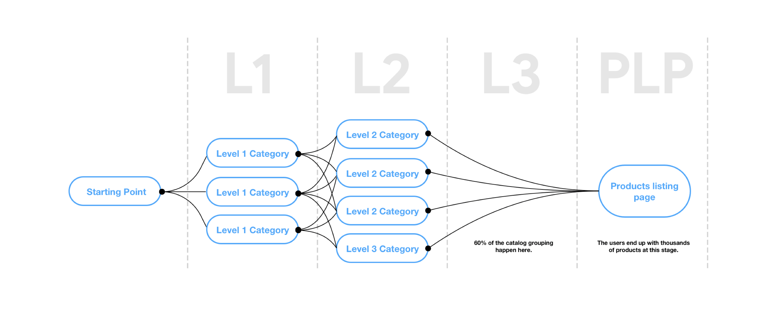
Current State Audit
Working with the catalogue team, I conducted a comprehensive audit of the existing navigation system. The analysis revealed a fundamental disconnect: the navigation structure presented to users didn't align with how products were actually organized in the backend catalog. This mismatch forced users to guess which category would contain their desired products.
Competitive Analysis
I analyzed leading e-commerce platforms in both regional and global markets, focusing on those with similar product assortments and target demographics:
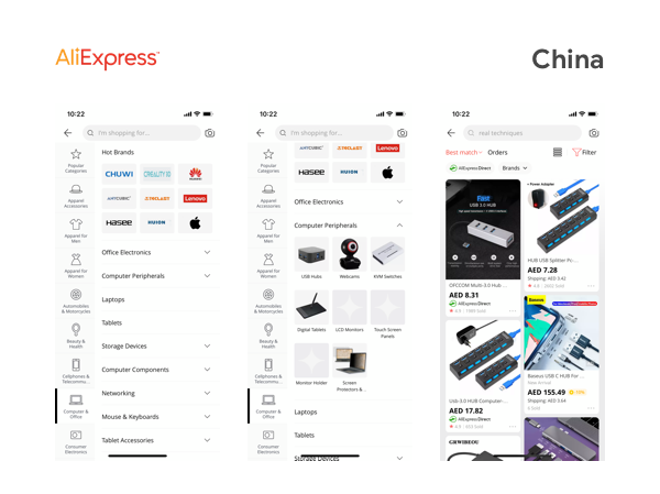
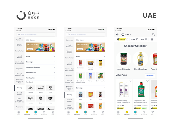
Key Insights:
- Successful platforms use 2-3 level category hierarchies maximum
- Personalization features reduce navigation friction for returning users
- Visual category cards perform better than text-only lists
- Quick filters at the PLP level significantly improve conversion
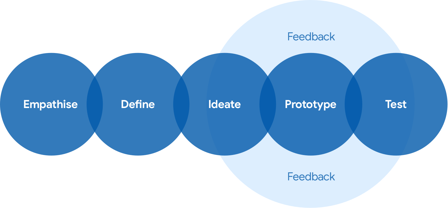
DESIGN PROCESS
Catalog Analysis & Mapping
I worked closely with the catalogue team to understand the complete product taxonomy. This involved mapping the relationship between catalog structure, user mental models, and search behavior patterns. The goal was to create a navigation system that felt intuitive while accurately reflecting the product organization.
Design Principles
Based on research insights, I established core principles to guide the redesign:
1. Clarity: Create a clear, logical navigation hierarchy that matches user expectations
2. Efficiency: Minimize steps to reach desired products
3. Personalization: Enable users to customize their navigation for frequent purchases
4. Scannability: Use visual hierarchy and clear labeling to help users quickly find what they need
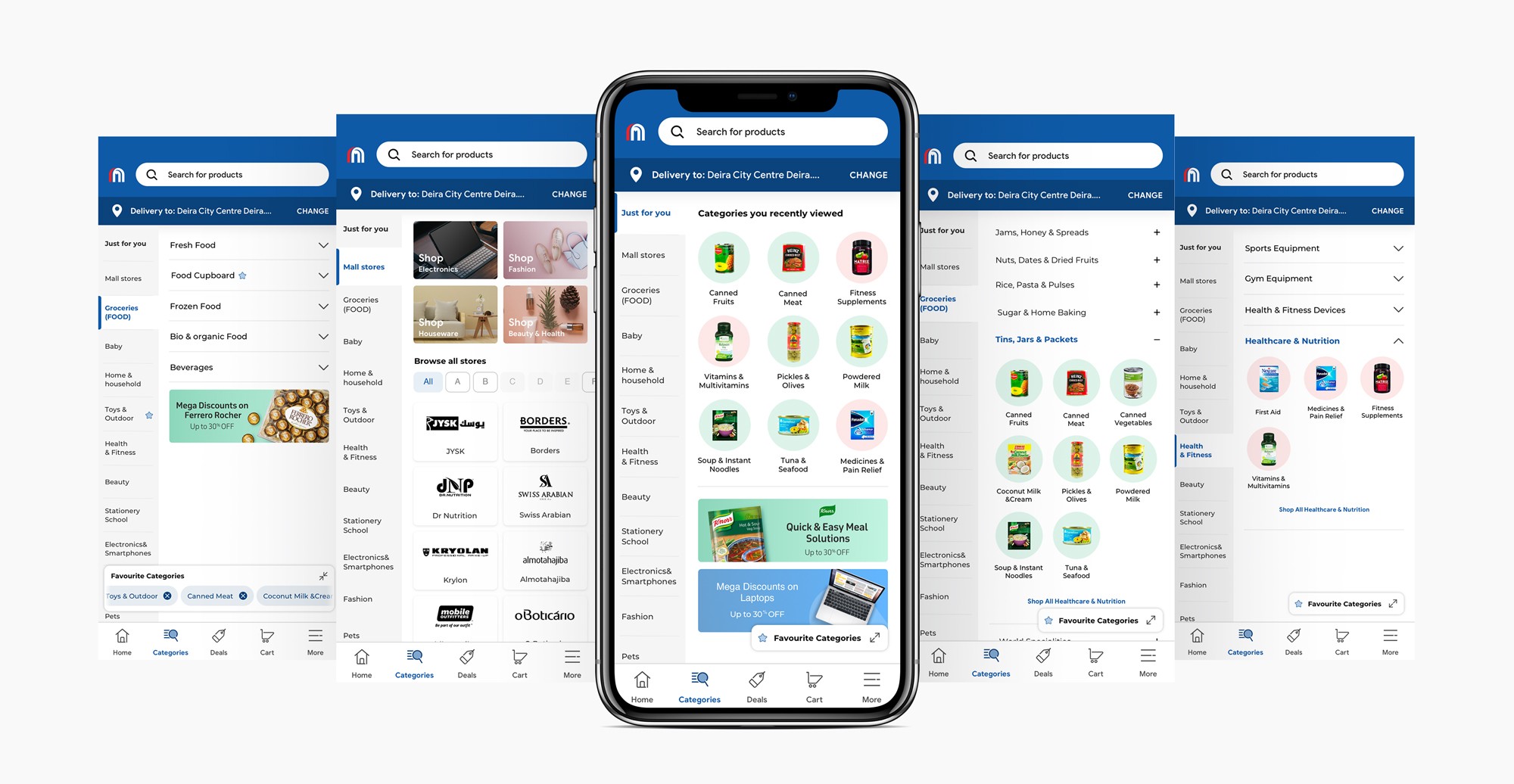
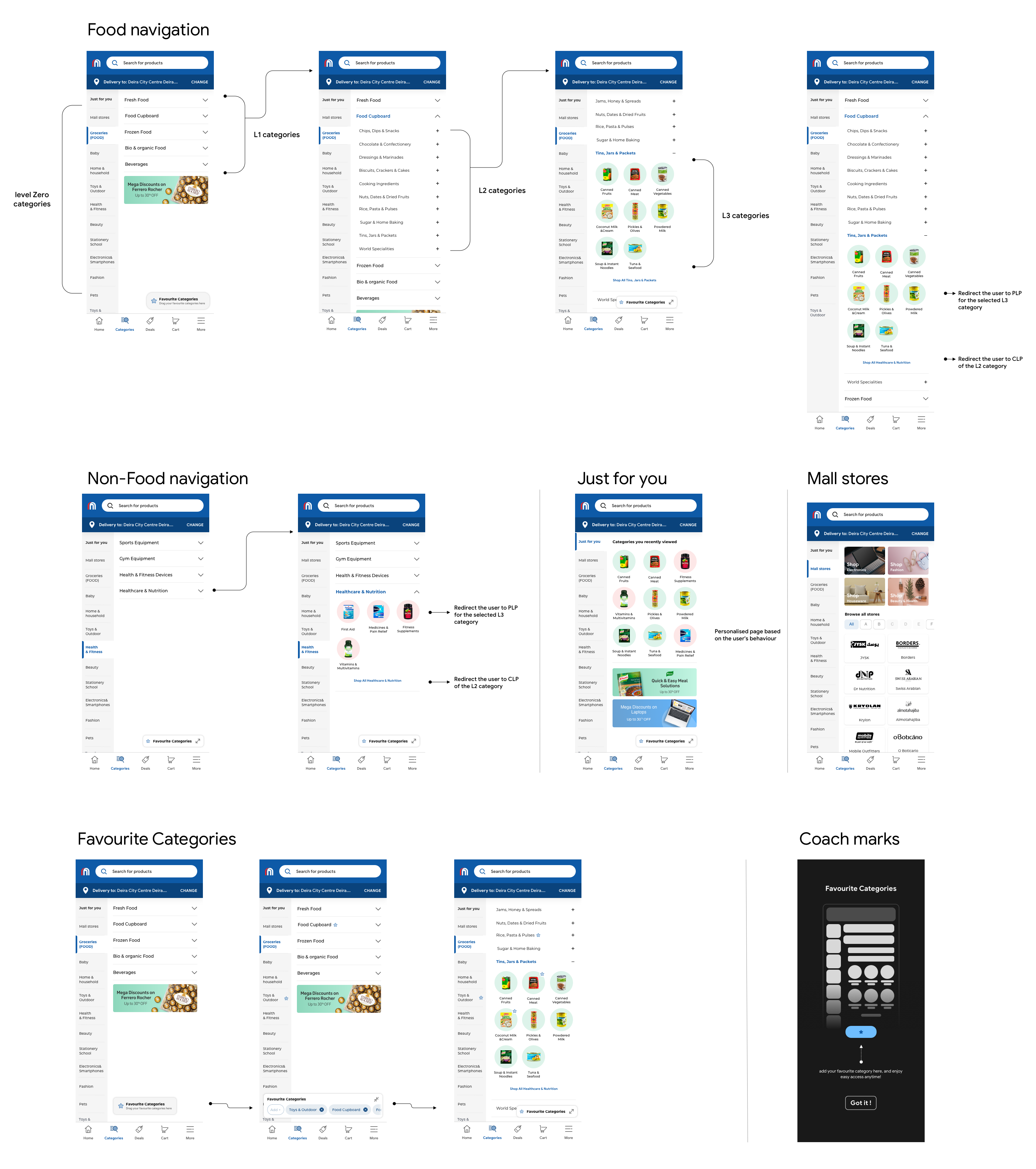
THE SOLUTION
I designed two navigation variants to test different approaches to hierarchy and information density. Both variants addressed the core issues but took different philosophical approaches:
Variant 1: Streamlined Hierarchy
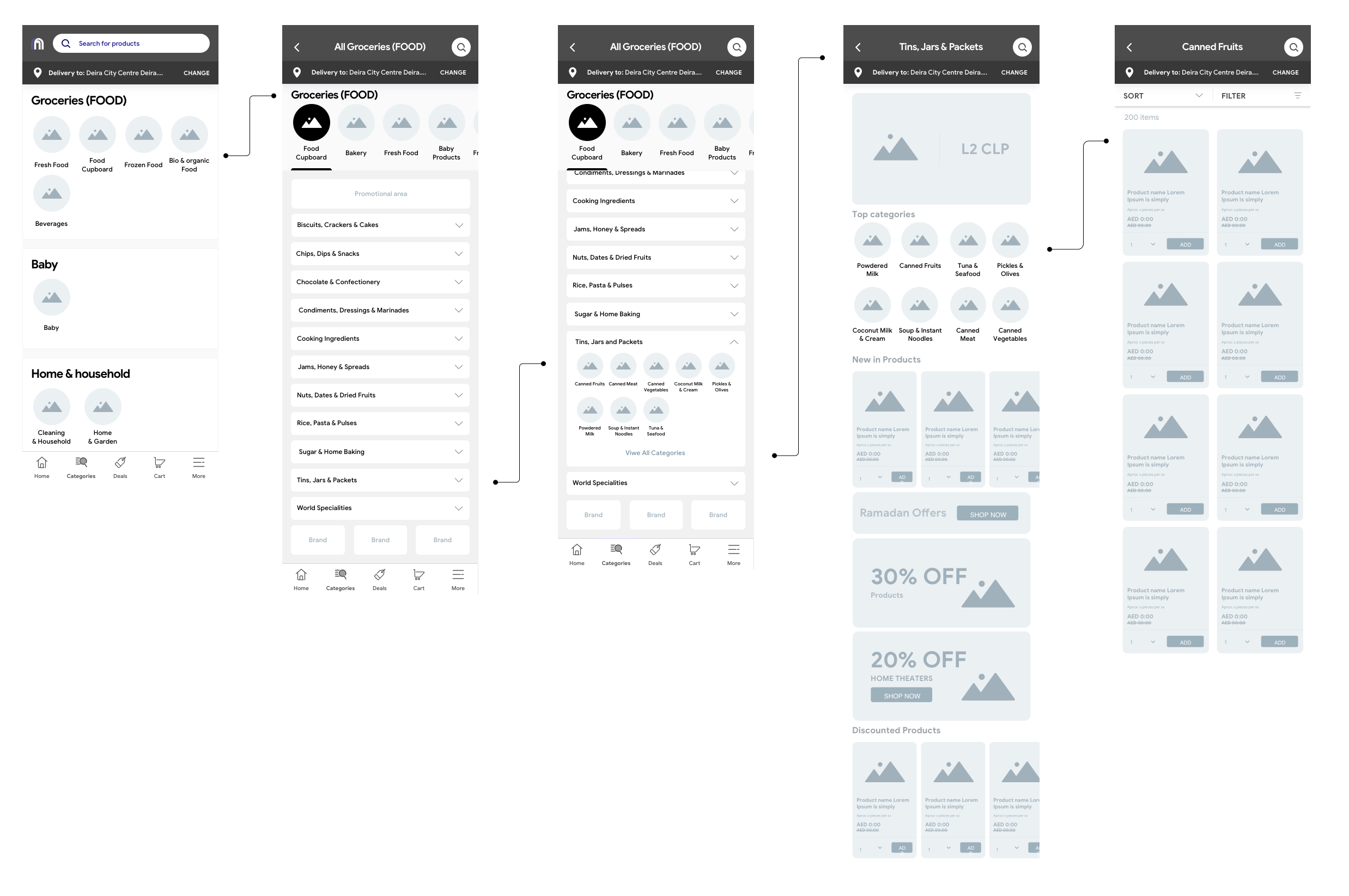
Featured a cleaner, more focused category structure with fewer top-level options. This approach prioritized simplicity and reduced cognitive load, making it easier for first-time users to navigate.
Variant 2: Comprehensive Navigation
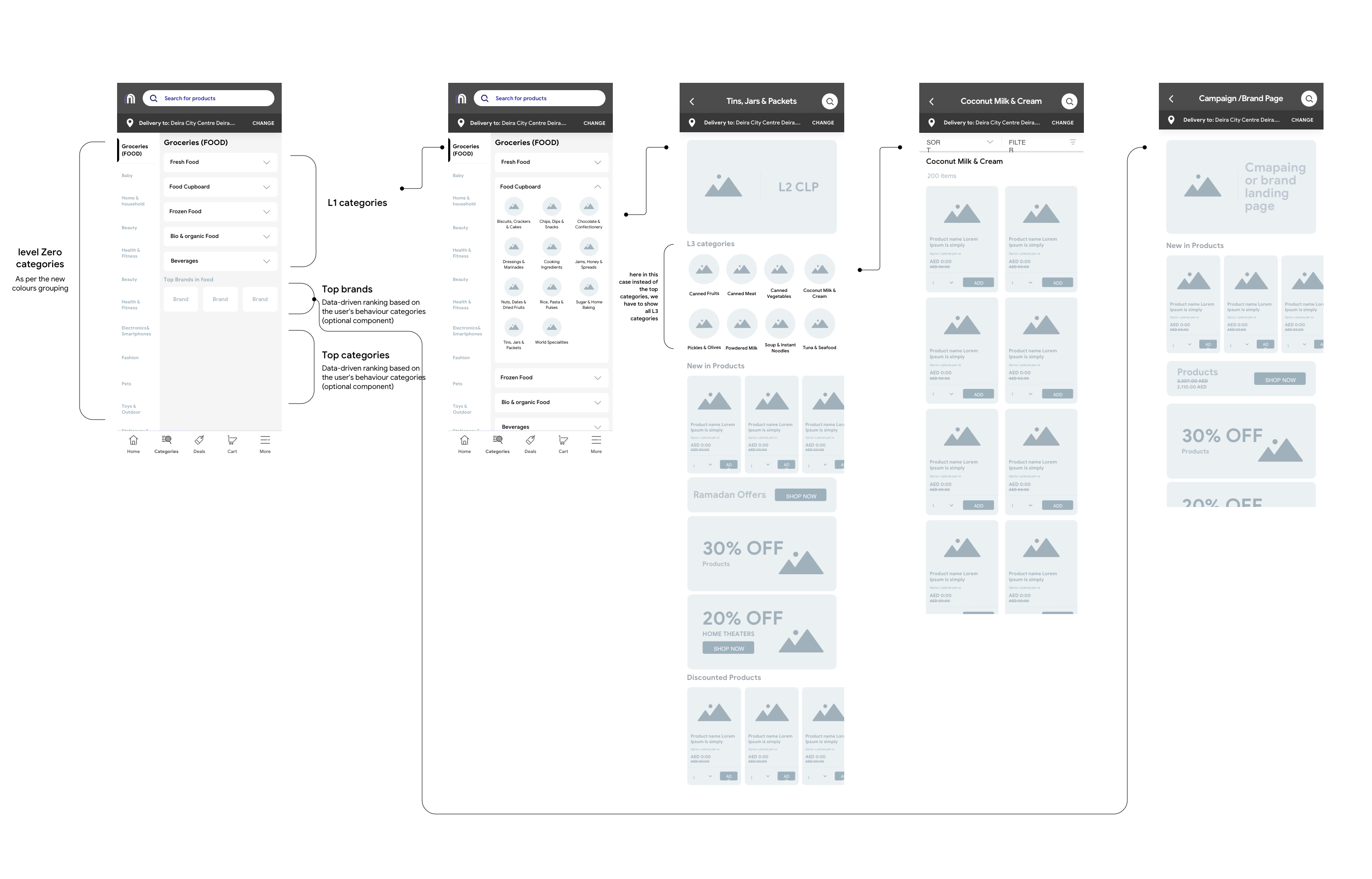
Offered more detailed category breakdowns at the first level, giving experienced users faster access to specific product types. This variant better matched the existing catalog structure.
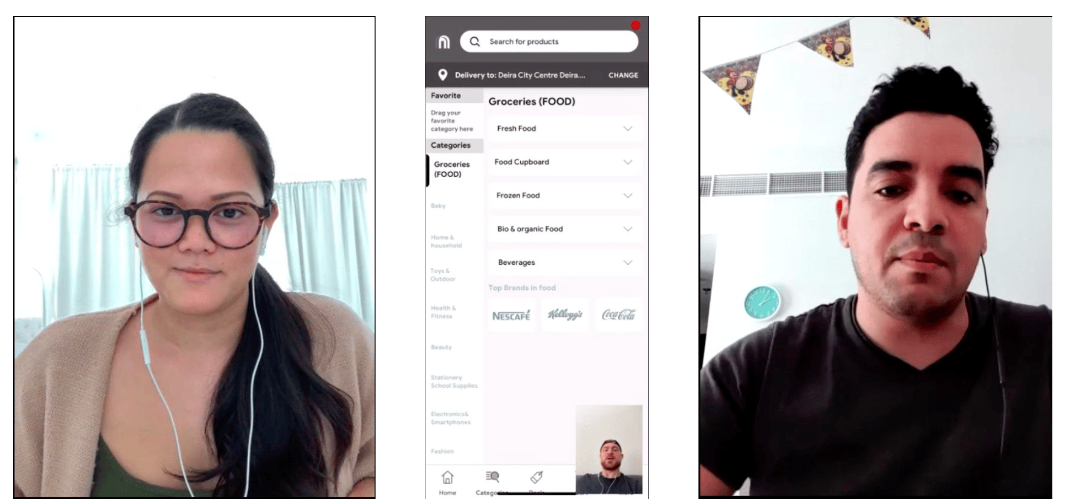
Key Feature: Personalized Category Shortcuts
Both variants included a personalized widget that allows users to create custom shortcuts to their most-used categories. This feature addresses a critical insight from our research: frequent shoppers often purchase from the same 3-5 categories repeatedly. By enabling users to customize their navigation at any level of the catalog hierarchy, we significantly reduced friction for returning customers.
- Appears prominently on the home screen
- Allows shortcuts to any level of category depth
- Can be easily customized through a simple tap-and-hold interface
- Syncs across devices for logged-in users
VALIDATION
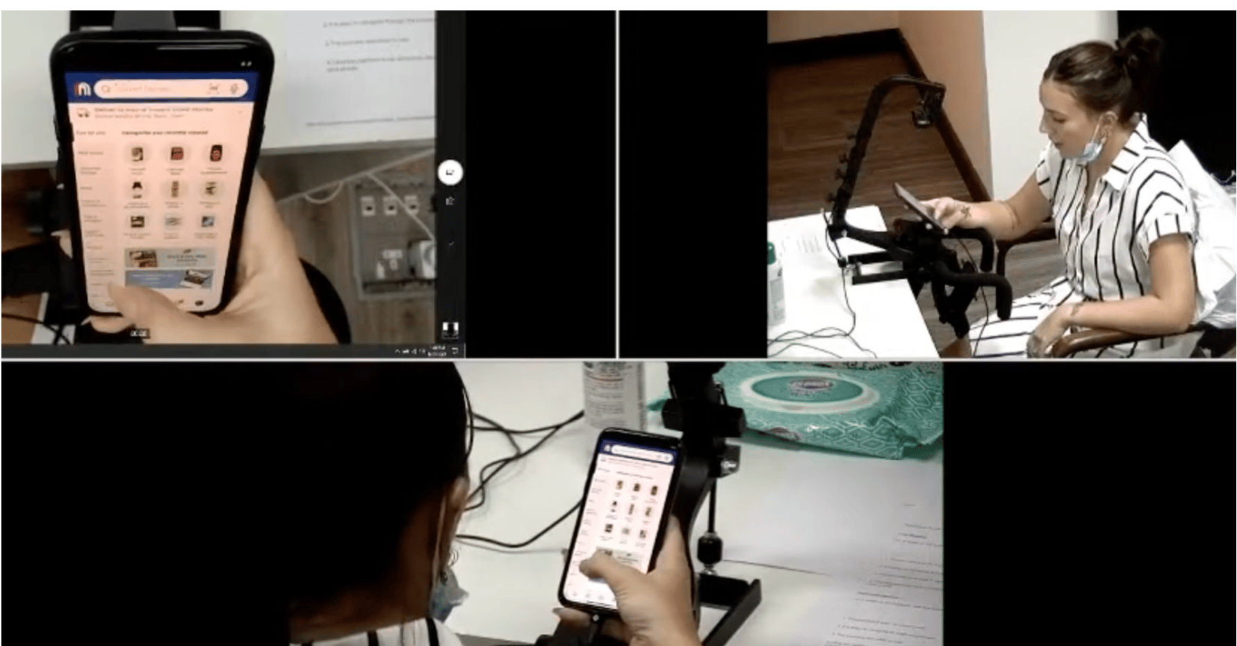
User Testing Methodology
I conducted moderated usability testing with 12 participants representing our core user demographics:
• Age range: 26-45 years
• Gender: 8 male, 4 female
• Platform split: 6 iOS, 6 Android users
• Nationalities: Indian (3), Japanese (2), Egyptian (3), British (2), Levant (2)
Key Findings
The testing revealed overwhelmingly positive results with an average satisfaction score of 4.7/5
• 100% of users successfully found products in target categories
• Navigation time reduced by average of 40%
• Personalized shortcuts were described as "game-changing" by frequent shoppers
• Minor adjustment needed: category label clarity for non-native English speakers
Design and development handover
Key Findings
The testing revealed overwhelmingly positive results with an average satisfaction score of 4.7/5
• 100% of users successfully found products in target categories
• Navigation time reduced by average of 40%
• Personalized shortcuts were described as "game-changing" by frequent shoppers
• Minor adjustment needed: category label clarity for non-native English speakers
RESULTS & IMPACT
Rollout Strategy
We launched the new navigation experience as an A/B test to 20% of users over a two-week period. This allowed us to validate the design at scale while minimizing risk to the business.
Measurable Outcomes
The redesign delivered significant improvements across all key metrics:
Funnel Performance:
• 37% increase in conversion from Categories to PLP (from 46% to 63%)
• 40% increase in conversion from PLP to PDP (from 39% to 54%)
• Overall funnel completion improved from 8% to 54% (575% increase)
Long-term Performance:
Following full rollout, the improved metrics stabilized and remained consistent, performing at industry-standard levels for e-commerce platforms. The personalized shortcuts feature showed particularly strong adoption, with 68% of returning users customizing their categories within the first week.
KEY LEARNINGS
What Worked Well
• Close collaboration with the catalogue team: Understanding the backend structure was essential to creating an intuitive frontend experience
• A/B testing approach: Rolling out to 20% first allowed us to validate and refine before full launch
• Personalization: The custom shortcuts exceeded expectations, becoming the most-used feature
Areas for Improvement
• Earlier user testing: Involving users before finalizing wireframes could have identified the labeling issues sooner
• Localization consideration: Multi-language support should have been considered earlier in the design process
NEXT STEPS
What Worked Well
Based on the success of this project, we've identified several opportunities for further enhancement:
- AI-powered category recommendations based on shopping history
- Enhanced filtering options at the PLP level
- Visual search capability to complement text-based navigation
- Multilingual optimization for Carrefour's diverse customer base
