

OVERVIEW
Role
Co-founder & Chief Product Officer
Timeline
MVP Launch (0→1)
Market
UAE On-Demand Services
Platforms
iOS, Android, Web
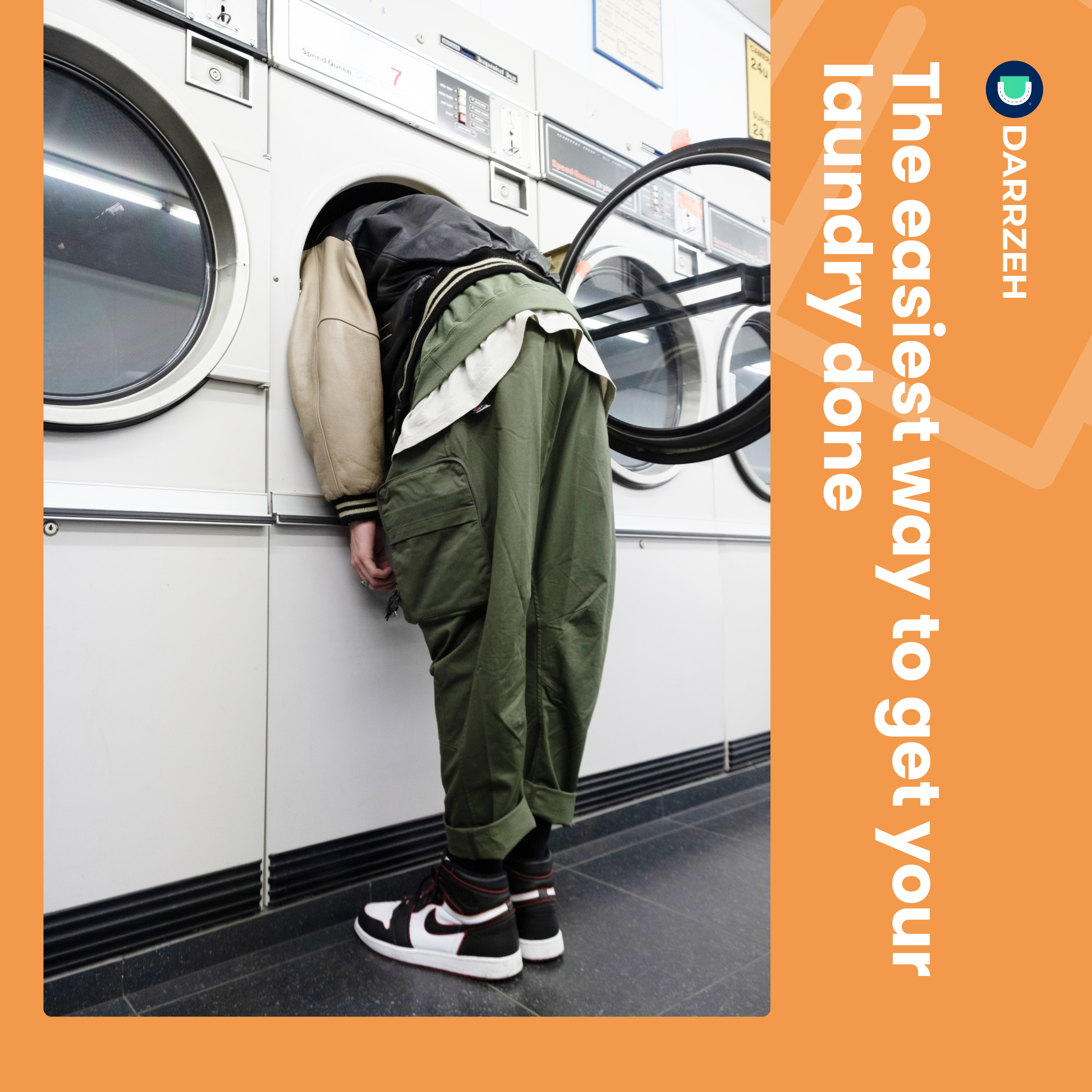
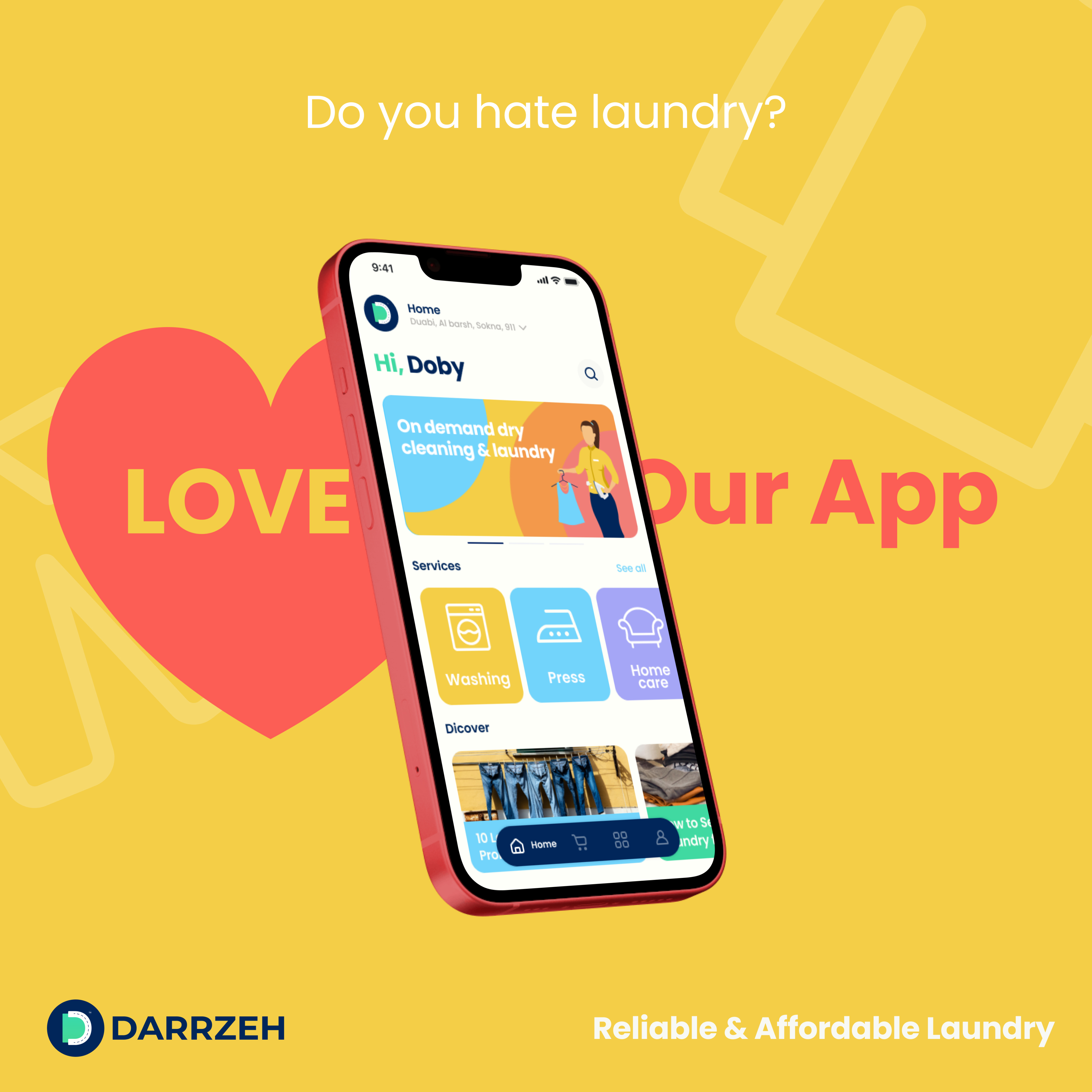
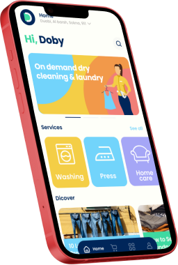
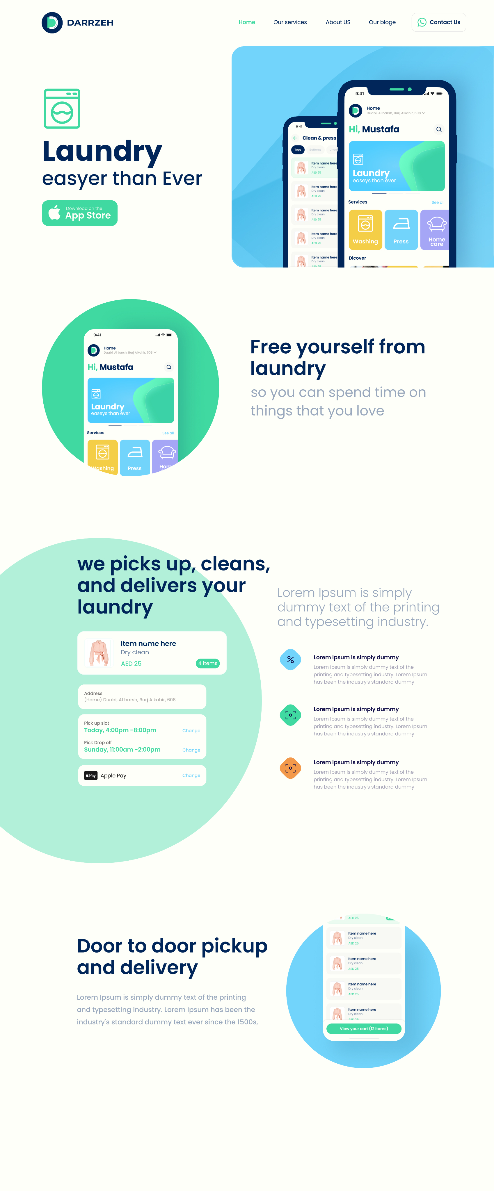
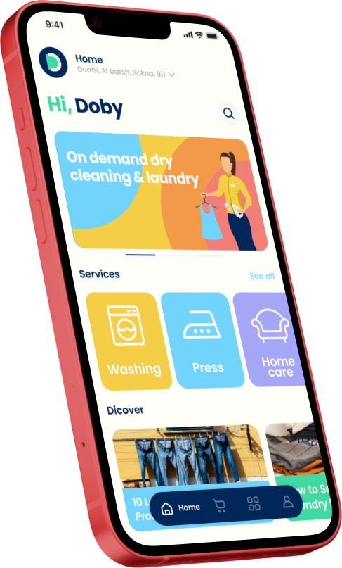
Darrzeh is a mobile application designed to make the laundry process easier and more convenient for users, eliminating the traditional need for laundromats.
As Co-founder and CPO, I led the entire product journey—from identifying the market opportunity and validating assumptions through user research, to defining the product architecture, establishing the brand identity, and designing the complete user experience across three interconnected platforms.
This case study showcases how I approached building a product from zero to one, balancing strategic thinking with hands-on execution.
The Strategic Challenge
The UAE laundry market represents a AED 2 billion opportunity, but incumbent players were failing to capture the on-demand convenience that modern consumers expected.
"How do we build a product that doesn't just digitize an existing service, but fundamentally reimagines how people think about laundry?"
AED 2,000,000,000
UAE Laundry Market Size
AED 84,000,000
Total Addressable Market (TAM)
MY STRATEGIC APPROACH
I followed a structured design thinking process, ensuring each phase informed the next and that we validated assumptions before committing resources.

Market & User Research
segmentation and analysis
Define


Ideate

Validate
Prototype
Feedback
Feedback
Market & User Research
Before designing a single screen, I invested in understanding both the market opportunity and the real problems users faced.
Pain Points Identified
Dealing with traditional laundromat is complicated
Pickup & drop-off hassle
Complicated and unclear pricing
Payment issues and friction
Lack of customer support
Opportunities Discovered
On-demand tailoring need exists
Users want real-time tracking
Transparent pricing is a differentiator
Trust through visibility
Convenience over cost sensitivity
Key Strategic Insight
Trust was the hidden barrier—users worried about clothes being lost or damaged. Transparency and visibility would be our core differentiators.
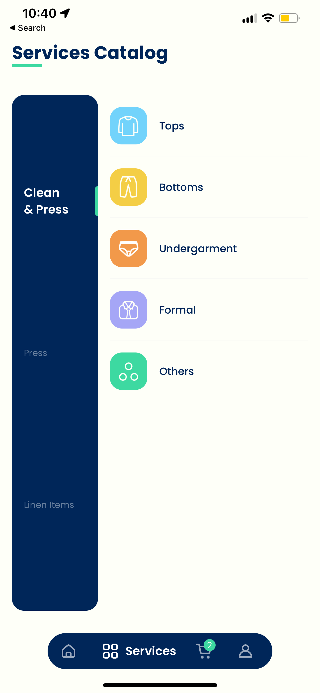
Information Architecture
Rather than jumping into UI design, I invested significant effort in defining the information architecture—recognizing that a flawed IA would create compounding UX debt.
Validation Through Card Sorting
Card sorting sessions revealed users grouped services by garment type (shirts, suits, delicates) rather than service type (wash, dry clean, iron)—fundamentally reshaping our navigation structure.
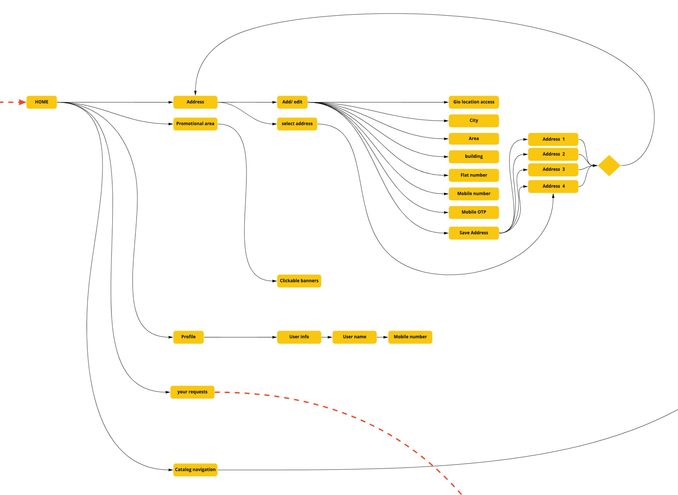
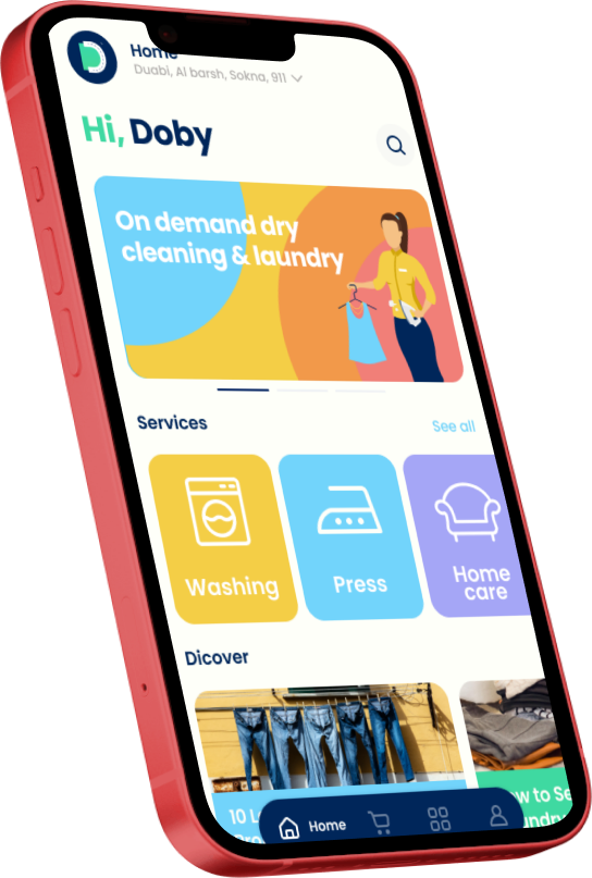
Three-Sided Platform Architecture
Customer App On-demand ordering
Transparent pricing
Real-time tracking
Flexible scheduling
Supply App
Driver task management
Route optimization
Status updates
Handoff management
Web Platform
Marketing & acquisition Service information
Trust building
App download funnel
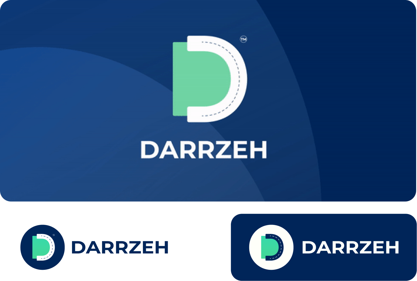
Brand Strategy & Identity
The brand needed to communicate three things: trust, convenience, and modernity.
Name
"Darrzeh" (درزه)—Arabic for "stitch," connecting craftsmanship with local identity


Typography
Poppins—geometric, modern, highly legible across English and Arabic

Poppins
Designed by Indian Type Foundry, Jonny Pinhorn
Geometric sans serif typefaces have been a popular design tool ever since these actors took to the world's stage. Poppins is one of the new comers to this long tradition. With support for the Devanagari and Latin writing systems, it is an internationalist take on the genre.
Visual Language
Illustration-forward approach to feel approachable and differentiate from sterile competitors


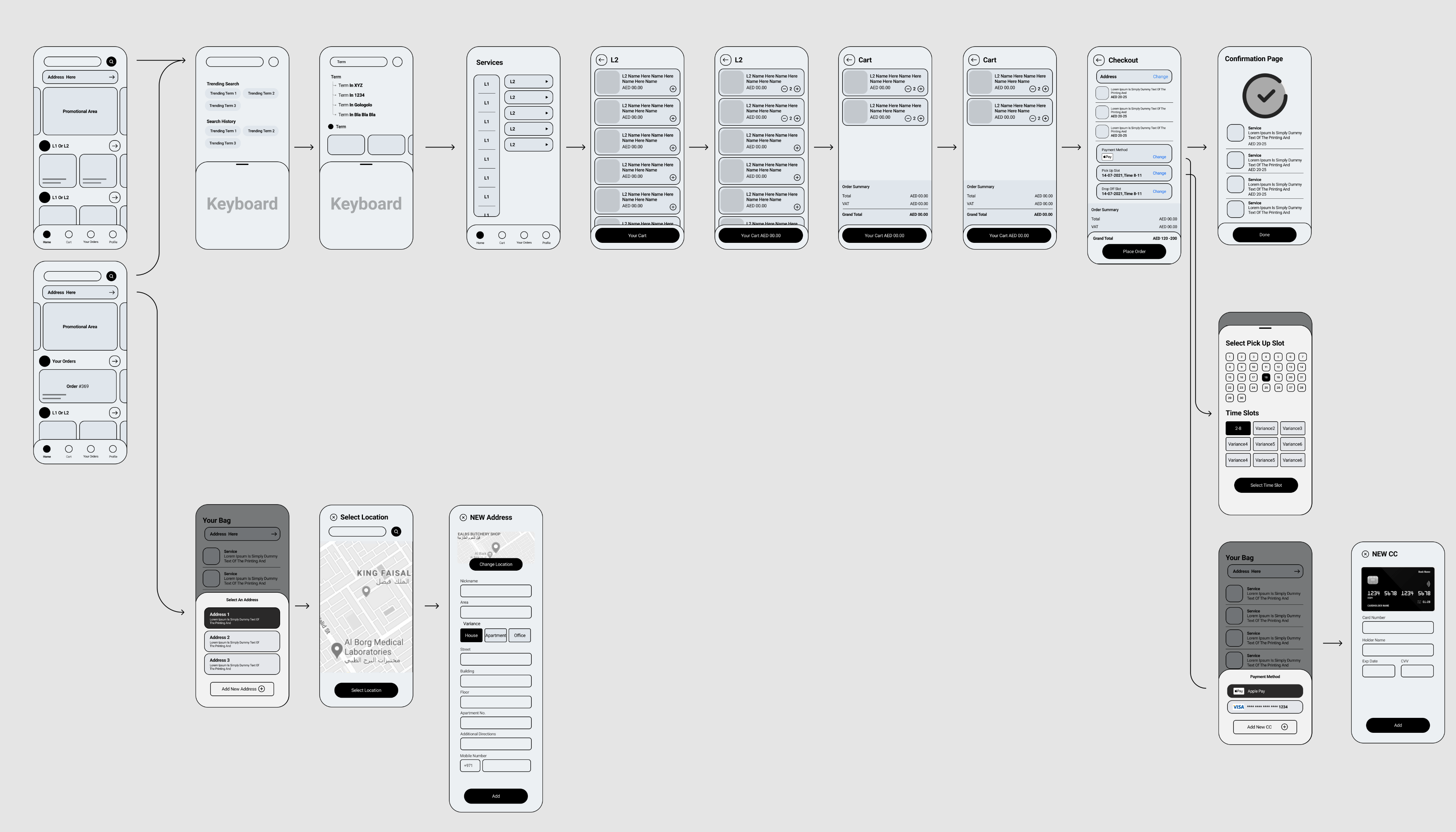
Wireframing & User Flows
Defining interaction patterns and validating flow logic before investing in high-fidelity design.
1
Discovery
2
Selection
3
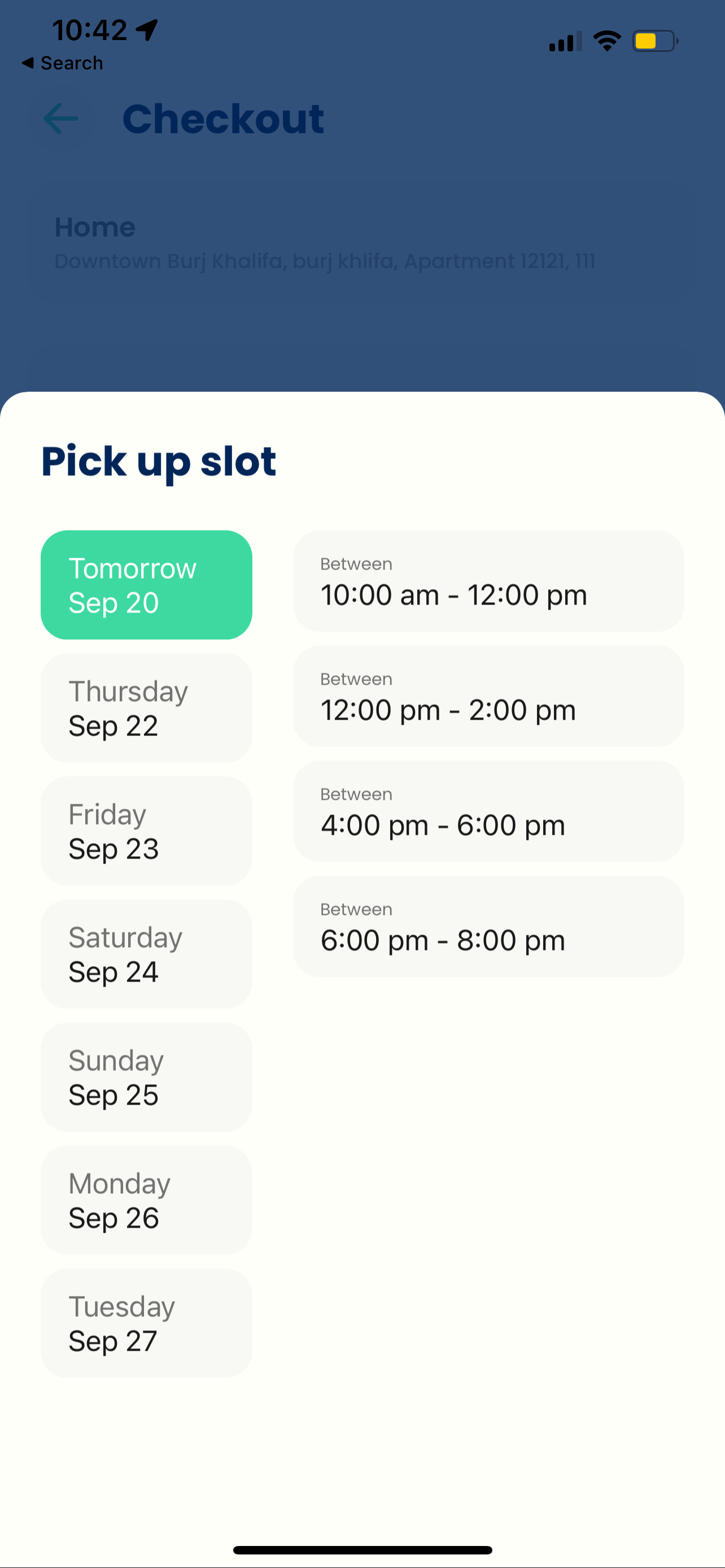
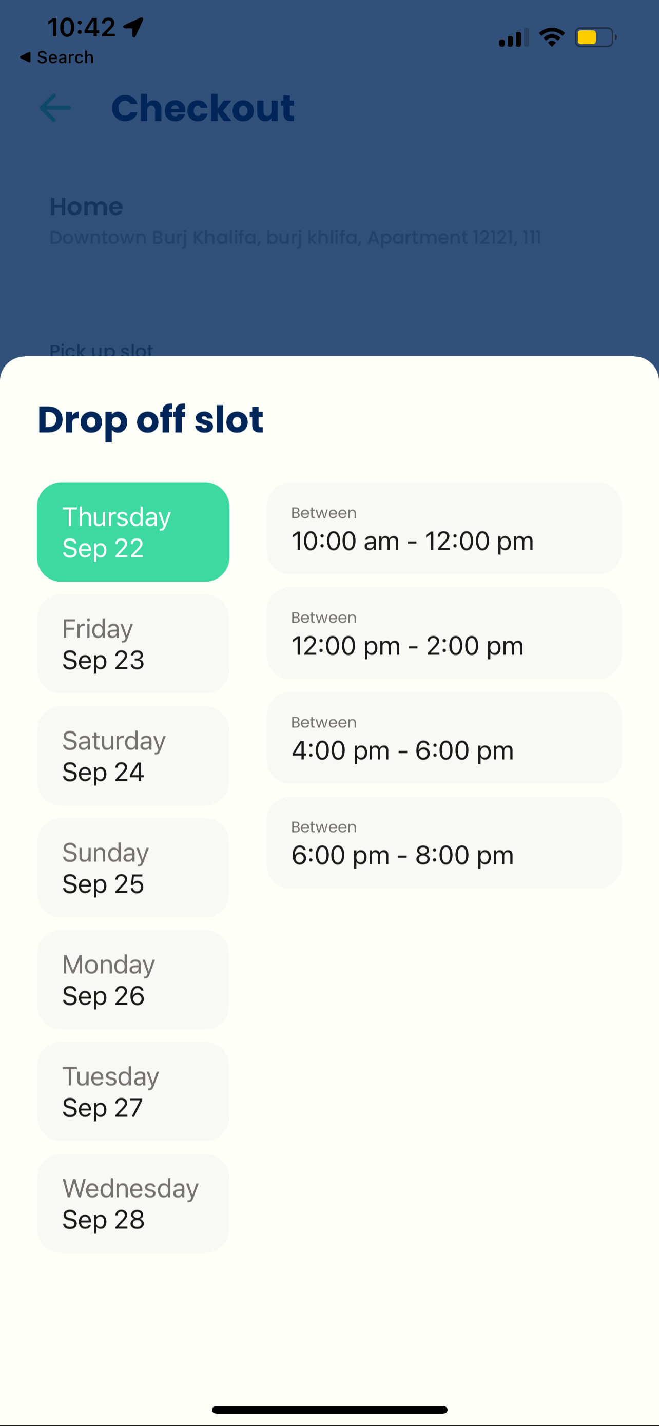
Scheduling
4
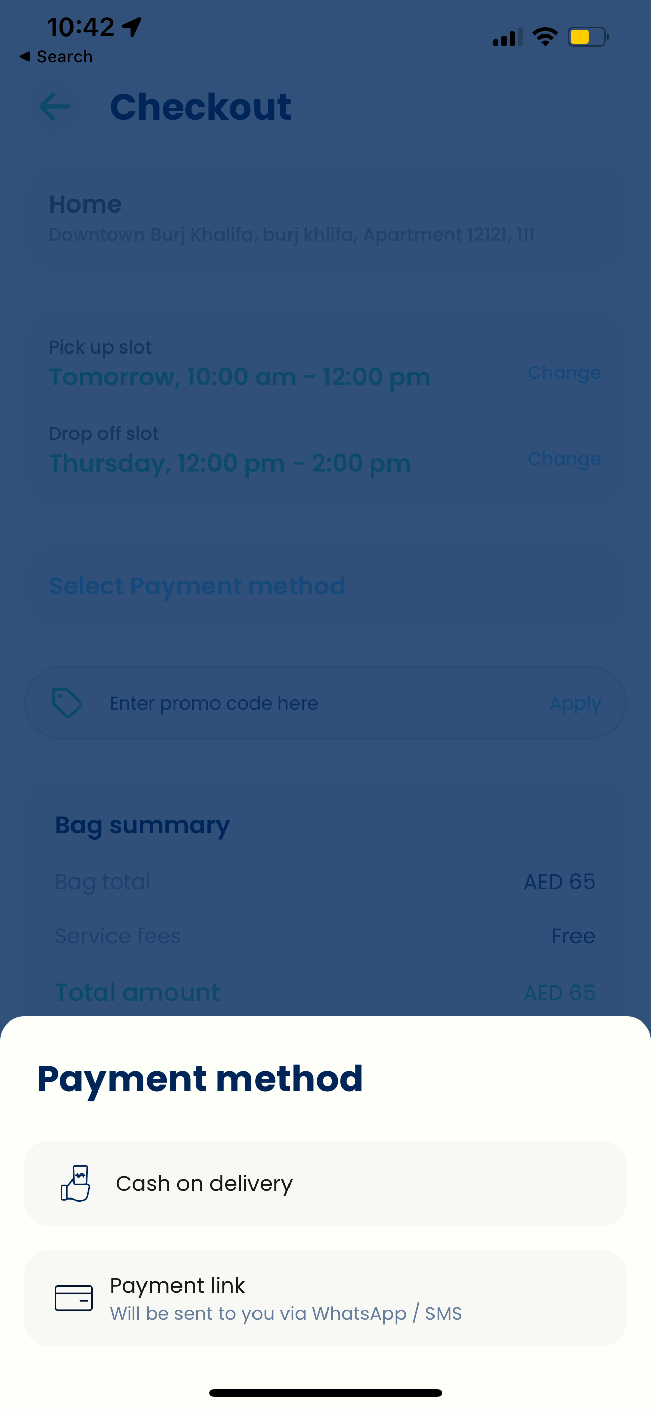
Confirmation
5
Tracking
6
Delivery
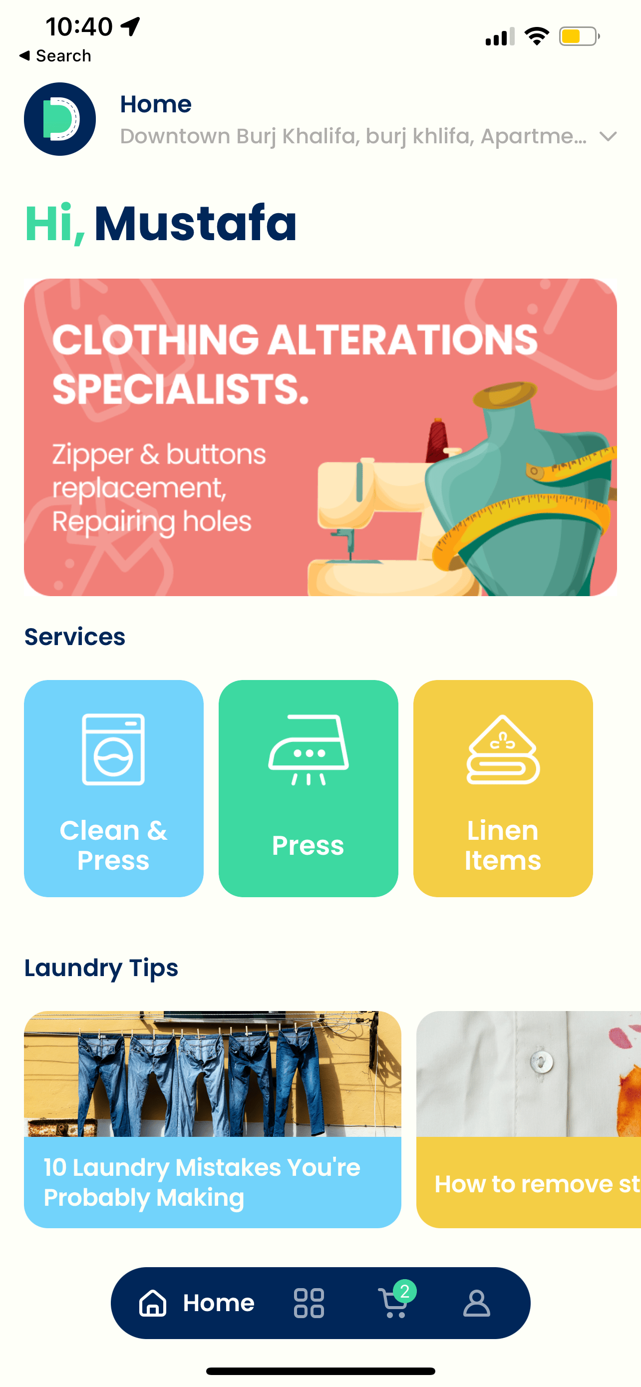
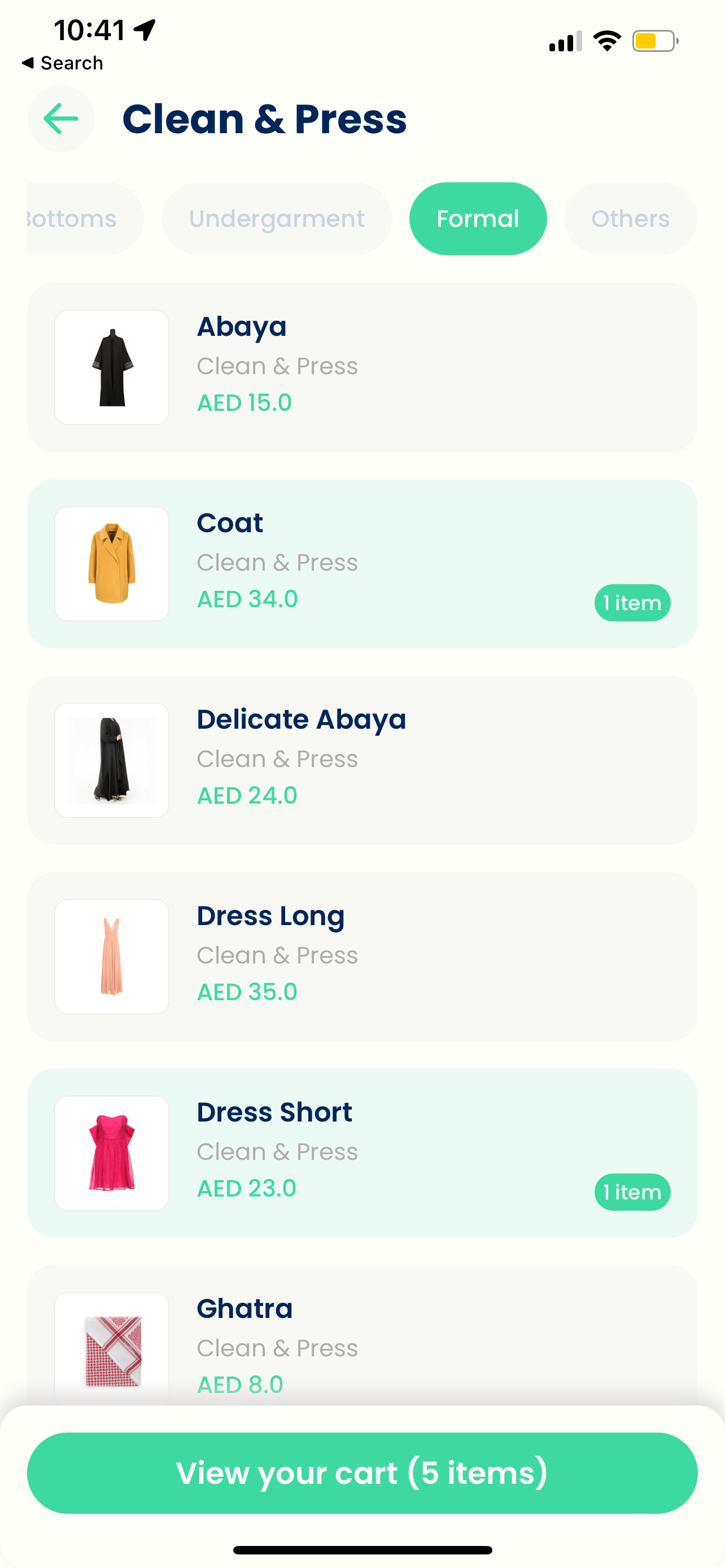
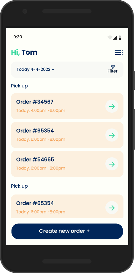
Customer App
UI/UX Design
Designed with a singular focus: make the complex feel simple. Every design decision was filtered through the question:
"Does this reduce friction or add it?"

💰
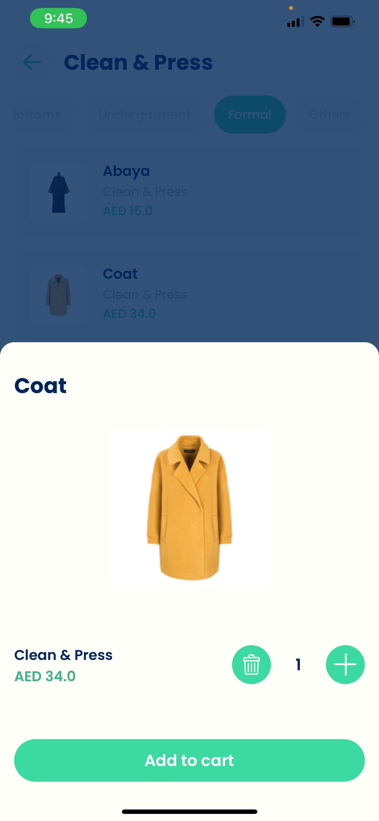
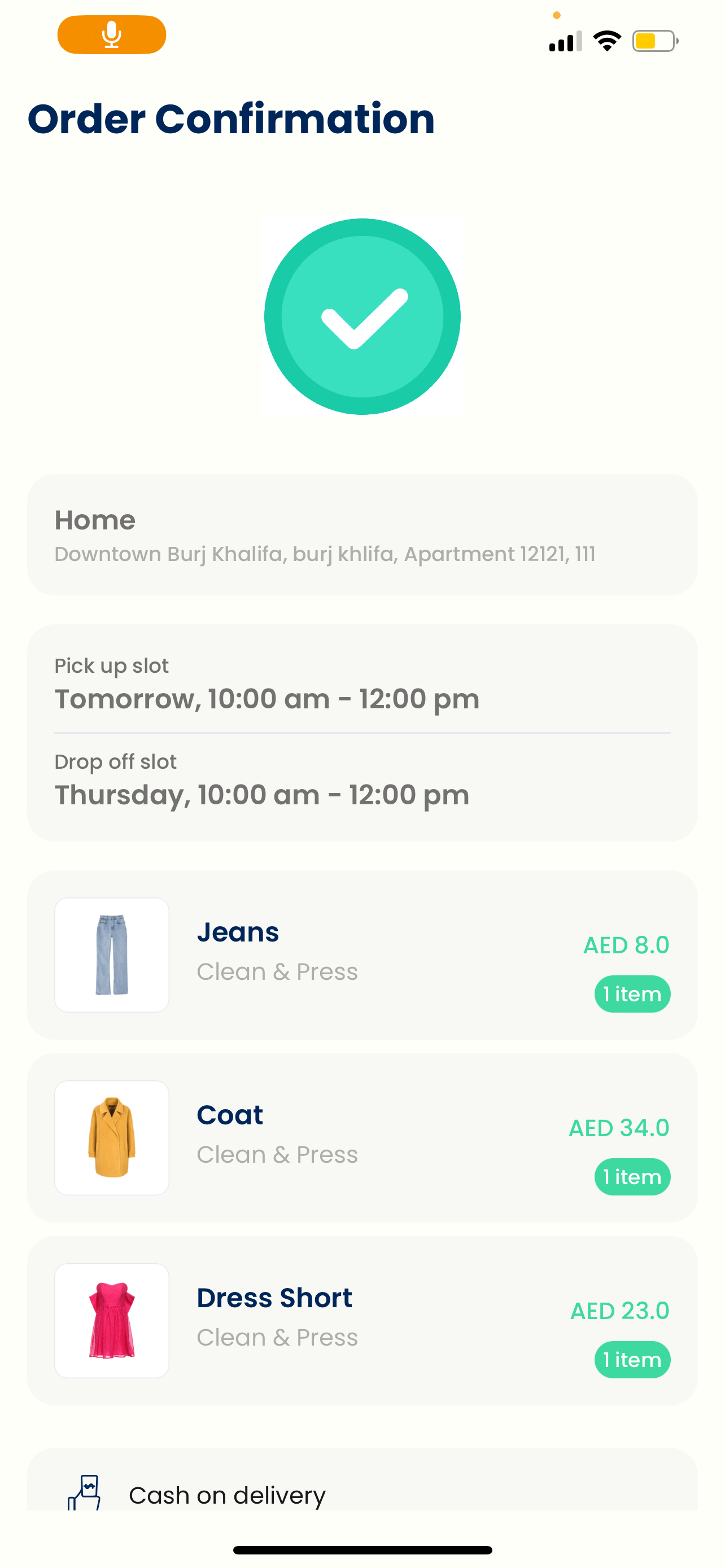
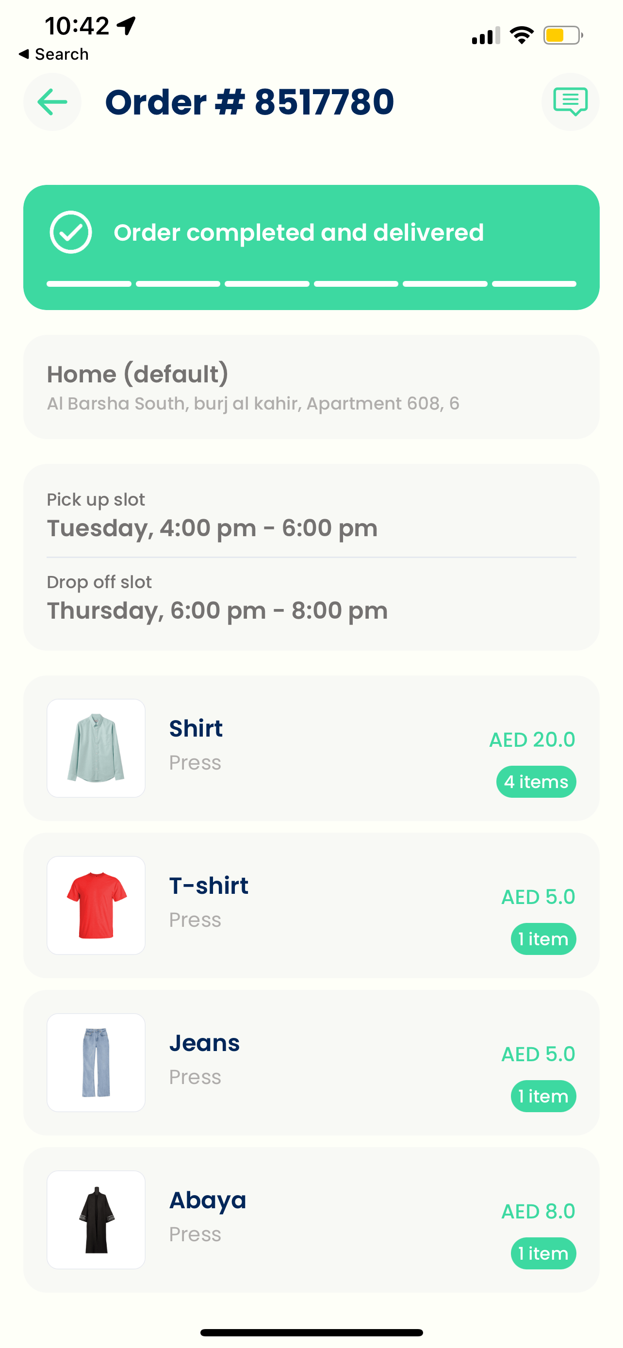
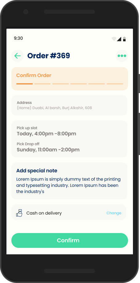
Transparent Pricing
Users see exact costs before committing
📍
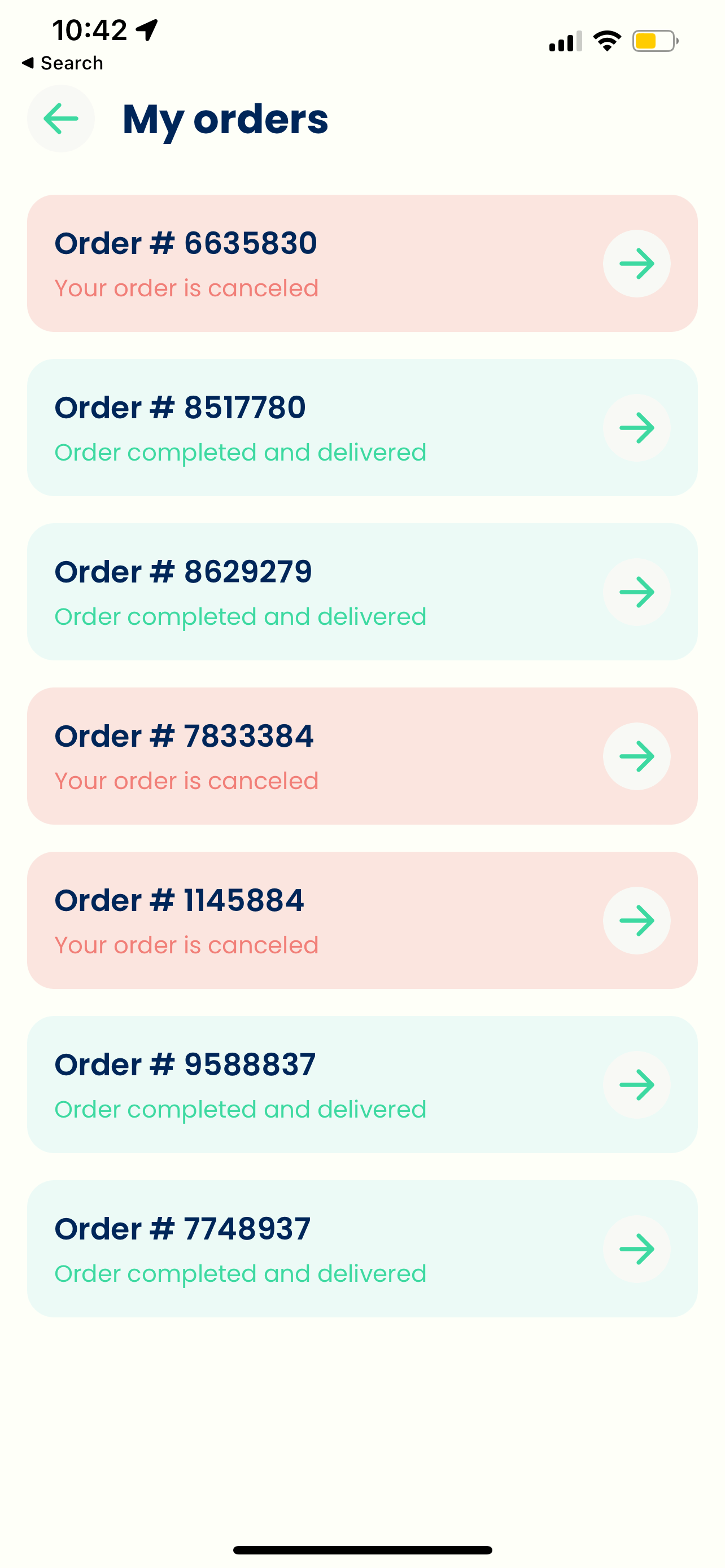
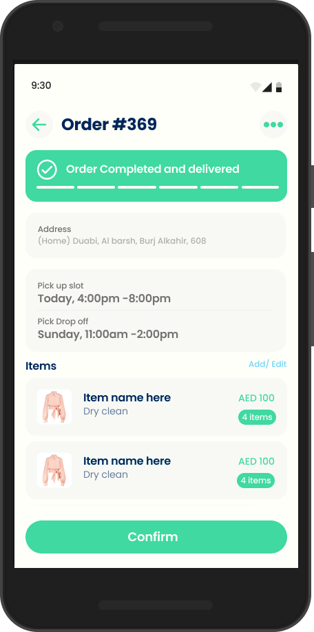
Real-Time Status
Progress indicators show exactly where clothes are
👕
Visual Order Building
Garment-based selection reduces cognitive load
⚠️
Friendly Error States
Helpful messaging maintains trust during failures

Reload

Oops!, something went wrong
Supply App (Drivers & Shoppers)
The backbone of the business. Driver experience directly impacts customer experience a frustrated driver leads to poor service.
👁️
Glanceable Info
👍
One-Handed Use
✅
Clear Status
📸
Photo Verification
Web Design (Landing Page)
Primary acquisition channel designed to build trust and drive app downloads.
MVP Scoping
One of my most important decisions was defining what
not
to build.
✓ MVP Included
• Core ordering flow with transparent pricing
• Real-time order tracking
• Driver app for logistics
• Basic scheduling (same-day, next-day)
• Photo verification system
✗ Intentionally Deferred
• Subscription model (needed usage data)
• In-app tailoring (complexity vs. frequency)
• Loyalty program (premature optimization)
• Multi-language support
• Advanced analytics dashboard
Key Strategic Decisions
We chose transparent pricing not flat-rate pricing
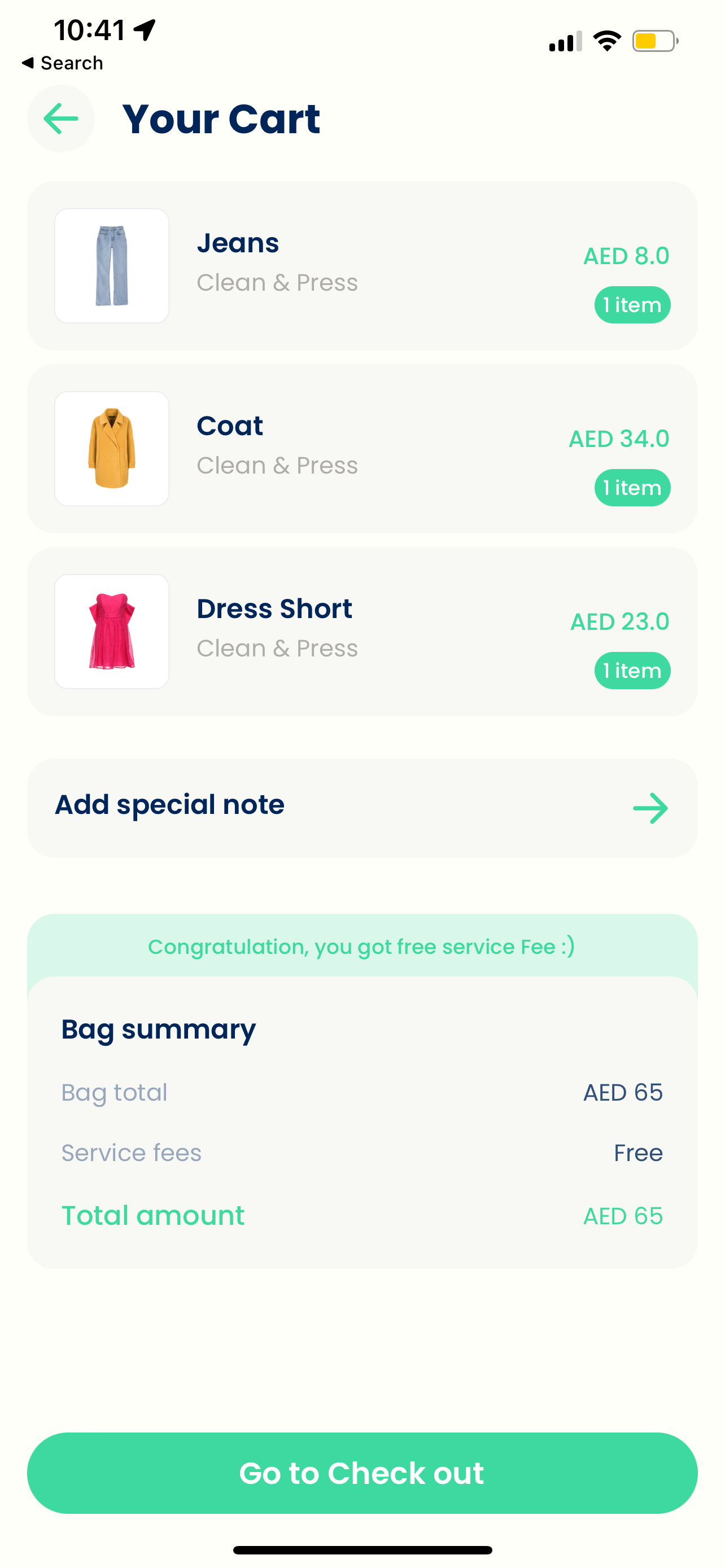
Research showed price anxiety was the #1 barrier to first-time orders. Flat rates feel like a black box users assume they're being overcharged. A real-time calculator makes the cost visible before commitment. 35% of users came back for a second order, and pricing clarity was consistently cited as a reason why.
We chose garment-based navigation not service-based navigation
Card sorting sessions revealed users think in terms of "my shirts, my suits, my delicates" not "wash, dry clean, iron." Reorganising around the user's mental model reduced cognitive load at the highest drop-off point in the flow. This single research finding reshaped the entire IA before a single screen was designed.
We chose to build a driver app from day one not manage drivers manually
Driver experience is customer experience. A driver with no visibility into their route creates late pickups, which creates distrust, which kills retention. The first version got this wrong order prioritizations wasn't clear and drivers couldn't tell what to do next. We rebuilt the logic around a single-next-order focus with location-based route optimisation. That fix came from testing with real drivers, which we should have done earlier.
We chose to defer subscriptions, tailoring, and loyalty not build them for launch
Without usage data we had no idea what cadence users actually had with laundry. Subscriptions need behavioural patterns to price correctly. Tailoring added operational complexity before we'd proven the core loop. Loyalty programs at zero scale are just noise. Shipping without them forced clarity on what actually mattered.
The Outcome
Darrzeh launched in the UAE with a three-sided platform across iOS, Android, and web. In the first three months, we processed 42 orders with a single driver deliberately constrained to validate the core loop before scaling supply. 35% of users returned for a second order, which told us the experience was working even if the numbers were small.
The brand landed well. The illustration forward visual language and the Arabic name درزه, stitch differentiated us in a market full of sterile, transactional competitors. That was a deliberate call and one I'd make again.
The business ended due to funding constraints, not product failure. The platform worked. The hypothesis that transparency and convenience could win in a commodities market held up. What we didn't have was enough runway to grow supply past one driver and prove the unit economics to outside investors.
What I'd carry forward: involve operations in design earlier. The driver app logic route optimisations, order prioritisations wasn't a UX problem, it was a systems problem that showed up as a UX problem. We caught it through driver testing but later than we should have. The lesson is that in marketplace products, the supply-side experience deserves the same research rigour as the consumer side, from day one.
Mustafa JawharyProduct & Strategy Designer

OVERVIEW
Role
Co-founder & Chief Product Officer
Timeline
MVP Launch (0→1)
Market
UAE On-Demand Services
Platforms
iOS, Android, Web
Darrzeh is a mobile application designed to make the laundry process easier and more convenient for users, eliminating the traditional need for laundromats.
As Co-founder and CPO, I led the entire product journey—from identifying the market opportunity and validating assumptions through user research, to defining the product architecture, establishing the brand identity, and designing the complete user experience across three interconnected platforms.
This case study showcases how I approached building a product from zero to one, balancing strategic thinking with hands-on execution.
The Strategic Challenge
The UAE laundry market represents a AED 2 billion opportunity, but incumbent players were failing to capture the on-demand convenience that modern consumers expected.
"How do we build a product that doesn't just digitize an existing service, but fundamentally reimagines how people think about laundry?"
AED 2,000,000,000
UAE Laundry Market Size
AED 84,000,000
Total Addressable Market (TAM)
MY STRATEGIC APPROACH
I followed a structured design thinking process, ensuring each phase informed the next and that we validated assumptions before committing resources.
Market & User Research
Before designing a single screen, I invested in understanding both the market opportunity and the real problems users faced.
Pain Points Identified
Dealing with traditional laundromat is complicated
Pickup & drop-off hassle
Complicated and unclear pricing
Payment issues and friction
Lack of customer support
Opportunities Discovered
On-demand tailoring need exists
Users want real-time tracking
Transparent pricing is a differentiator
Trust through visibility
Convenience over cost sensitivity
Key Strategic Insight
Trust was the hidden barrier—users worried about clothes being lost or damaged. Transparency and visibility would be our core differentiators.
Information Architecture
Rather than jumping into UI design, I invested significant effort in defining the information architecture—recognizing that a flawed IA would create compounding UX debt.
Validation Through Card Sorting
Card sorting sessions revealed users grouped services by garment type (shirts, suits, delicates) rather than service type (wash, dry clean, iron)—fundamentally reshaping our navigation structure.

Market & User Research
segmentation and analysis
Define


Ideate

Validate
Prototype
Feedback
Feedback
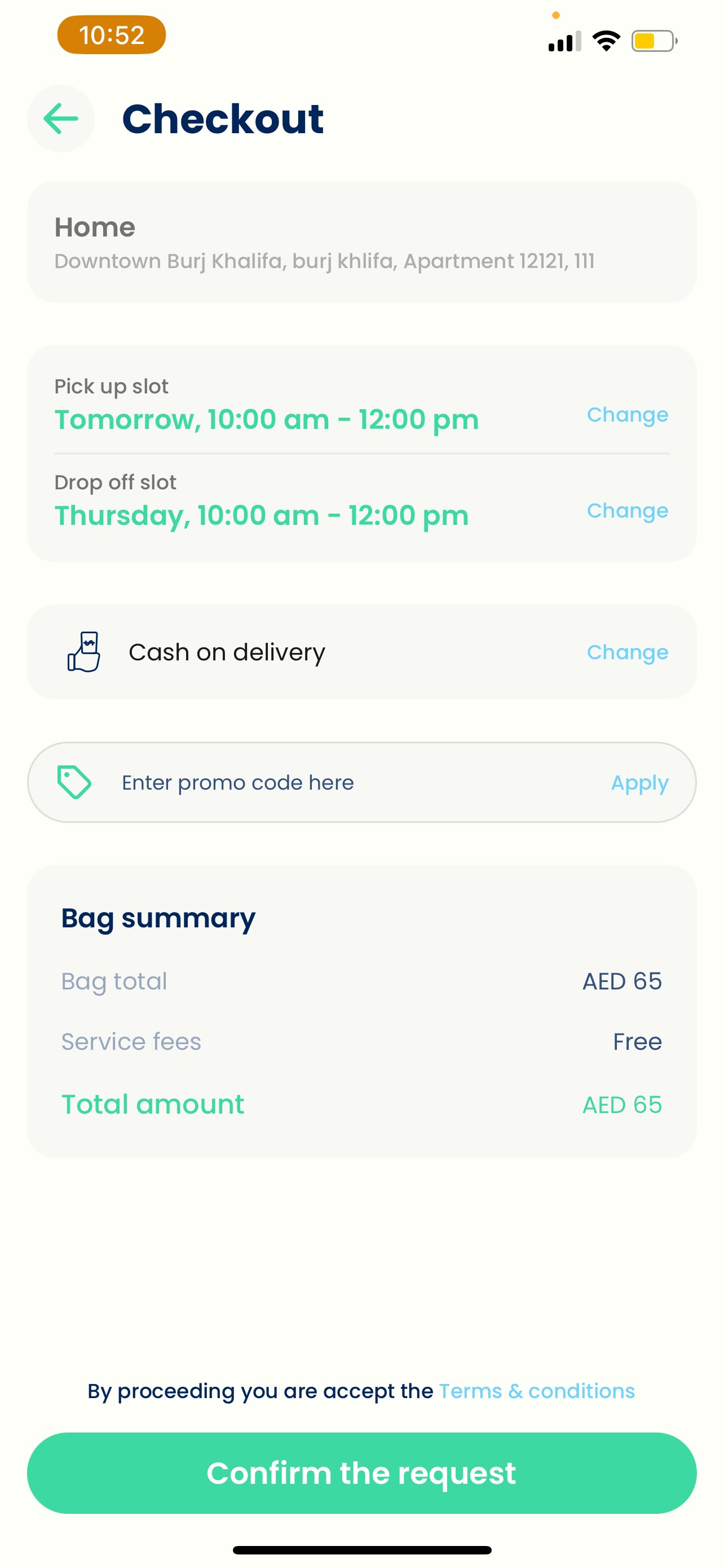
Three-Sided Platform Architecture
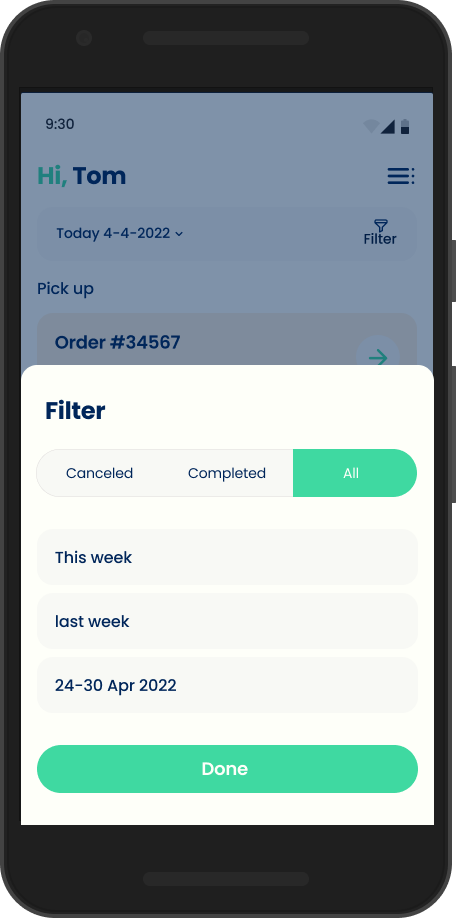
Customer App On-demand ordering
Transparent pricing
Real-time tracking
Flexible scheduling
Supply App
Driver task management
Route optimization
Status updates
Handoff management
Web Platform
Marketing & acquisition Service information
Trust building
App download funnel
Brand Strategy & Identity
The brand needed to communicate three things: trust, convenience, and modernity.
Name
"Darrzeh" (درزه)—Arabic for "stitch," connecting craftsmanship with local identity
Typography
Poppins—geometric, modern, highly legible across English and Arabic

Poppins
Designed by Indian Type Foundry, Jonny Pinhorn
Geometric sans serif typefaces have been a popular design tool ever since these actors took to the world's stage. Poppins is one of the new comers to this long tradition. With support for the Devanagari and Latin writing systems, it is an internationalist take on the genre.
Visual Language
Illustration-forward approach to feel approachable and differentiate from sterile competitors
Wireframing & User Flows
Defining interaction patterns and validating flow logic before investing in high-fidelity design.
1
Discovery
2
Selection
3
Scheduling
4
Confirmation
5
Tracking
6
Delivery
Customer App
UI/UX Design
Designed with a singular focus: make the complex feel simple. Every design decision was filtered through the question:
"Does this reduce friction or add it?"
💰
Transparent Pricing
Users see exact costs before committing
📍
Real-Time Status
Progress indicators show exactly where clothes are
👕
Visual Order Building
Garment-based selection reduces cognitive load
⚠️
Friendly Error States
Helpful messaging maintains trust during failures

Reload
Oops!, something went wrong
Supply App (Drivers & Shoppers)
The backbone of the business. Driver experience directly impacts customer experience a frustrated driver leads to poor service.
👁️
Glanceable Info
👍
One-Handed Use
✅
Clear Status
📸
Photo Verification
Web Design (Landing Page)
Primary acquisition channel designed to build trust and drive app downloads.
MVP Scoping
One of my most important decisions was defining what
not
to build.
✓ MVP Included
• Core ordering flow with transparent pricing
• Real-time order tracking
• Driver app for logistics
• Basic scheduling (same-day, next-day)
• Photo verification system
✗ Intentionally Deferred
• Subscription model (needed usage data)
• In-app tailoring (complexity vs. frequency)
• Loyalty program (premature optimization)
• Multi-language support
• Advanced analytics dashboard
Key Strategic Decisions
We chose transparent pricing not flat-rate pricing
Research showed price anxiety was the #1 barrier to first-time orders. Flat rates feel like a black box users assume they're being overcharged. A real-time calculator makes the cost visible before commitment. 35% of users came back for a second order, and pricing clarity was consistently cited as a reason why.
We chose garment-based navigation not service-based navigation
Card sorting sessions revealed users think in terms of "my shirts, my suits, my delicates" not "wash, dry clean, iron." Reorganising around the user's mental model reduced cognitive load at the highest drop-off point in the flow. This single research finding reshaped the entire IA before a single screen was designed.
We chose to build a driver app from day one not manage drivers manually
Driver experience is customer experience. A driver with no visibility into their route creates late pickups, which creates distrust, which kills retention. The first version got this wrong order prioritizations wasn't clear and drivers couldn't tell what to do next. We rebuilt the logic around a single-next-order focus with location-based route optimisation. That fix came from testing with real drivers, which we should have done earlier.
We chose to defer subscriptions, tailoring, and loyalty not build them for launch
Without usage data we had no idea what cadence users actually had with laundry. Subscriptions need behavioural patterns to price correctly. Tailoring added operational complexity before we'd proven the core loop. Loyalty programs at zero scale are just noise. Shipping without them forced clarity on what actually mattered.
The Outcome
Darrzeh launched in the UAE with a three-sided platform across iOS, Android, and web. In the first three months, we processed 42 orders with a single driver deliberately constrained to validate the core loop before scaling supply. 35% of users returned for a second order, which told us the experience was working even if the numbers were small.
The brand landed well. The illustration forward visual language and the Arabic name درزه, stitch differentiated us in a market full of sterile, transactional competitors. That was a deliberate call and one I'd make again.
The business ended due to funding constraints, not product failure. The platform worked. The hypothesis that transparency and convenience could win in a commodities market held up. What we didn't have was enough runway to grow supply past one driver and prove the unit economics to outside investors.
What I'd carry forward: involve operations in design earlier. The driver app logic route optimisations, order prioritisations wasn't a UX problem, it was a systems problem that showed up as a UX problem. We caught it through driver testing but later than we should have. The lesson is that in marketplace products, the supply-side experience deserves the same research rigour as the consumer side, from day one.

OVERVIEW
Role
Co-founder & Chief Product Officer
Timeline
MVP Launch (0→1)
Market
UAE On-Demand Services
Platforms
iOS, Android, Web
Darrzeh is a mobile application designed to make the laundry process easier and more convenient for users, eliminating the traditional need for laundromats.
As Co-founder and CPO, I led the entire product journey—from identifying the market opportunity and validating assumptions through user research, to defining the product architecture, establishing the brand identity, and designing the complete user experience across three interconnected platforms.
This case study showcases how I approached building a product from zero to one, balancing strategic thinking with hands-on execution.
The Strategic Challenge
The UAE laundry market represents a AED 2 billion opportunity, but incumbent players were failing to capture the on-demand convenience that modern consumers expected.
"How do we build a product that doesn't just digitize an existing service, but fundamentally reimagines how people think about laundry?"
AED 2,000,000,000
UAE Laundry Market Size
AED 84,000,000
Total Addressable Market (TAM)
MY STRATEGIC APPROACH
I followed a structured design thinking process, ensuring each phase informed the next and that we validated assumptions before committing resources.

Market & User Research
segmentation and analysis
Define


Ideate

Validate
Prototype
Feedback
Feedback
Market & User Research
Before designing a single screen, I invested in understanding both the market opportunity and the real problems users faced.
Pain Points Identified
Dealing with traditional laundromat is complicated
Pickup & drop-off hassle
Complicated and unclear pricing
Payment issues and friction
Lack of customer support
Opportunities Discovered
On-demand tailoring need exists
Users want real-time tracking
Transparent pricing is a differentiator
Trust through visibility
Convenience over cost sensitivity
Key Strategic Insight
Trust was the hidden barrier—users worried about clothes being lost or damaged. Transparency and visibility would be our core differentiators.
Information Architecture
Rather than jumping into UI design, I invested significant effort in defining the information architecture—recognizing that a flawed IA would create compounding UX debt.
Validation Through Card Sorting
Card sorting sessions revealed users grouped services by garment type (shirts, suits, delicates) rather than service type (wash, dry clean, iron)—fundamentally reshaping our navigation structure.
Three-Sided Platform Architecture
Customer App On-demand ordering
Transparent pricing
Real-time tracking
Flexible scheduling
Supply App
Driver task management
Route optimization
Status updates
Handoff management
Web Platform
Marketing & acquisition Service information
Trust building
App download funnel
Brand Strategy & Identity
The brand needed to communicate three things: trust, convenience, and modernity.
Name
"Darrzeh" (درزه)—Arabic for "stitch," connecting craftsmanship with local identity

Typography
Poppins—geometric, modern, highly legible across English and Arabic

Poppins
Designed by Indian Type Foundry, Jonny Pinhorn
Geometric sans serif typefaces have been a popular design tool ever since these actors took to the world's stage. Poppins is one of the new comers to this long tradition. With support for the Devanagari and Latin writing systems, it is an internationalist take on the genre.
Visual Language
Illustration-forward approach to feel approachable and differentiate from sterile competitors
Wireframing & User Flows
Defining interaction patterns and validating flow logic before investing in high-fidelity design.
1
Discovery
→
2
Selection
→
3
Scheduling
→
4
Confirmation
→
5
Tracking
→
6
Delivery
Customer App
UI/UX Design
Designed with a singular focus: make the complex feel simple. Every design decision was filtered through the question:
"Does this reduce friction or add it?"
💰
Transparent Pricing
Users see exact costs before committing
📍
Real-Time Status
Progress indicators show exactly where clothes are
👕
Visual Order Building
Garment-based selection reduces cognitive load
⚠️
Friendly Error States
Helpful messaging maintains trust during failures

Reload
Oops!, something went wrong
Retry
Oops!, No internet connection

Supply App (Drivers & Shoppers)
The backbone of the business. Driver experience directly impacts customer experience a frustrated driver leads to poor service.
👁️
Glanceable Info
👍
One-Handed Use
✅
Clear Status
📸
Photo Verification
Web Design (Landing Page)
Primary acquisition channel designed to build trust and drive app downloads.
MVP Scoping
One of my most important decisions was defining what
not
to build.
✓ MVP Included
• Core ordering flow with transparent pricing
• Real-time order tracking
• Driver app for logistics
• Basic scheduling (same-day, next-day)
• Photo verification system
✗ Intentionally Deferred
• Subscription model (needed usage data)
• In-app tailoring (complexity vs. frequency)
• Loyalty program (premature optimization)
• Multi-language support
• Advanced analytics dashboard
Key Strategic Decisions
We chose transparent pricing, not flat-rate pricing
Research showed price anxiety was the #1 barrier to first-time orders. Flat rates feel like a black box users assume they're being overcharged. A real-time calculator makes the cost visible before commitment. 35% of users came back for a second order, and pricing clarity was consistently cited as a reason why.
We chose garment-based navigation, not service-based navigation
Card sorting sessions revealed users think in terms of "my shirts, my suits, my delicates" not "wash, dry clean, iron." Reorganising around the user's mental model reduced cognitive load at the highest drop-off point in the flow. This single research finding reshaped the entire IA before a single screen was designed.
We chose to build a driver app from day one, not manage drivers manually
Driver experience is customer experience. A driver with no visibility into their route creates late pickups, which creates distrust, which kills retention. The first version got this wrong order prioritizations wasn't clear and drivers couldn't tell what to do next. We rebuilt the logic around a single-next-order focus with location-based route optimisation. That fix came from testing with real drivers, which we should have done earlier.
We chose to defer subscriptions, tailoring, and loyalty not build them for launch
Without usage data we had no idea what cadence users actually had with laundry. Subscriptions need behavioural patterns to price correctly. Tailoring added operational complexity before we'd proven the core loop. Loyalty programs at zero scale are just noise. Shipping without them forced clarity on what actually mattered.
The Outcome
Darrzeh launched in the UAE with a three-sided platform across iOS, Android, and web. In the first three months, we processed 42 orders with a single driver deliberately constrained to validate the core loop before scaling supply. 35% of users returned for a second order, which told us the experience was working even if the numbers were small.
The brand landed well. The illustration forward visual language and the Arabic name درزه, stitch differentiated us in a market full of sterile, transactional competitors. That was a deliberate call and one I'd make again.
The business ended due to funding constraints, not product failure. The platform worked. The hypothesis that transparency and convenience could win in a commoditised market held up. What we didn't have was enough runway to grow supply past one driver and prove the unit economics to outside investors.
What I'd carry forward: involve operations in design earlier. The driver app logic route optimisations, order prioritisations wasn't a UX problem, it was a systems problem that showed up as a UX problem. We caught it through driver testing but later than we should have. The lesson is that in marketplace products, the supply-side experience deserves the same research rigour as the consumer side, from day one.